Consent banners are found on almost every website, but many companies still make mistakes that not only affect the user experience but also pose legal risks. Here are the 6 most common mistakes and how you can easily avoid them:
1. Lack of Access to Legal Information and Unclear Data Processing
A common mistake in consent banner design is that access to the imprint and privacy policy is blocked or restricted before the user has given their consent. However, according to Articles 13 and 14 of the GDPR, this information must be freely accessible at all times, without requiring consent. Users must be able to access information about data processing before making a decision.
Additionally, the purpose of data processing must be briefly and clearly communicated in the banner. Detailed information, such as which personal data is affected, what happens to it, and who has access, can be provided via a link to the privacy policy.
Tip: Ensure that the imprint and privacy policy are always linked in the website’s footer and accessible without consent. Alternatively, you can include a clearly visible link directly in the consent banner. The banner itself should contain a brief explanation of the processing purpose, e.g., “We use cookies for analytics and personalized advertising,” and link to the privacy policy where detailed information is available.
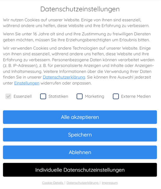
Picture 1. an example that showcases all necessary informations
2. Misleading Design (Dark Patterns)
Another frequent issue with cookie banners is the use of dark patterns. Those are deceptive design elements that subtly push users toward giving consent. Often, the “Accept” button is visually emphasized, while options like “Reject” or “Customize settings” are harder to find or less prominent. This can create the impression that consent is the only reasonable choice.
However, according to Article 7 of the GDPR, consent must be given freely. This means the user must have a genuine choice, without being influenced by the design. If the banner makes it difficult to decline, the consent is not voluntary and therefore invalid.
Tip: Present all options equally. “Accept,” “Reject,” and “Customize settings” should be the same size, visible, and easily accessible so that the user can make an informed decision.
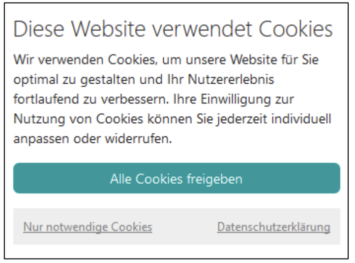
Picture 2. an example for dark patterns
3. No Granular Cookie Selection
Under Article 6 of the GDPR, users must not be forced to accept all cookies in general. They must be given the option to choose between different categories of cookies, such as necessary, functional, and marketing cookies. However, many cookie banners only offer the options to “Accept all” or “Reject all,” which is insufficient.
Tip: Provide users with a clear option to choose between different cookie categories. Clearly explain the purpose of each category so users know exactly what they are consenting to.
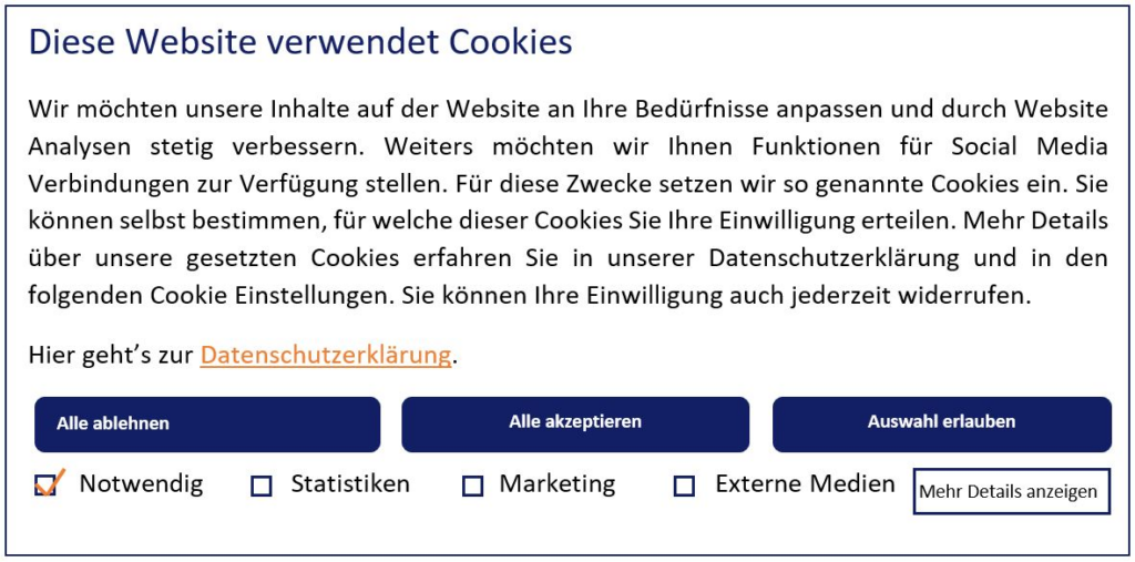
Picture 3. an example with clear options to choose between different cookie categories
4. Vague or Misleading Headlines
In addition to the required information, the language and visual design of the cookie banner play a crucial role. According to Article 12 of the GDPR, information must be presented “in a concise, transparent, intelligible and easily accessible form.” However, many banners use vague headlines such as “We respect your privacy” or “To improve your user experience,” which do not adequately inform users about the implications of their consent.
Tip: Use clear and precise headlines that directly inform users about what will happen to their data.
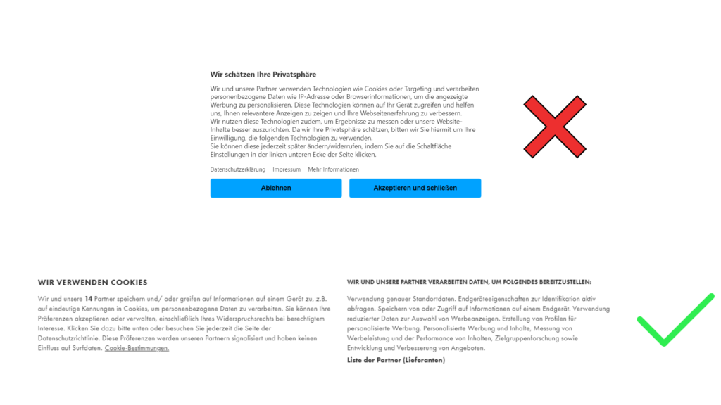
Picture 5. + 6. picture 5 is an example with an unclear title and the title in picture 6 is clear with its intent.
5. No Easy Way to Withdraw or Modify Consent
According to Article 7 (3) of the GDPR, users have the right to withdraw or modify their consent at any time. However, many cookie banners either do not offer this option or make it difficult to find.
Tip: Include an easily accessible way to change cookie settings, for example, via a permanent link in the website’s footer. The process of withdrawing or adjusting consent should be just as simple as granting it.
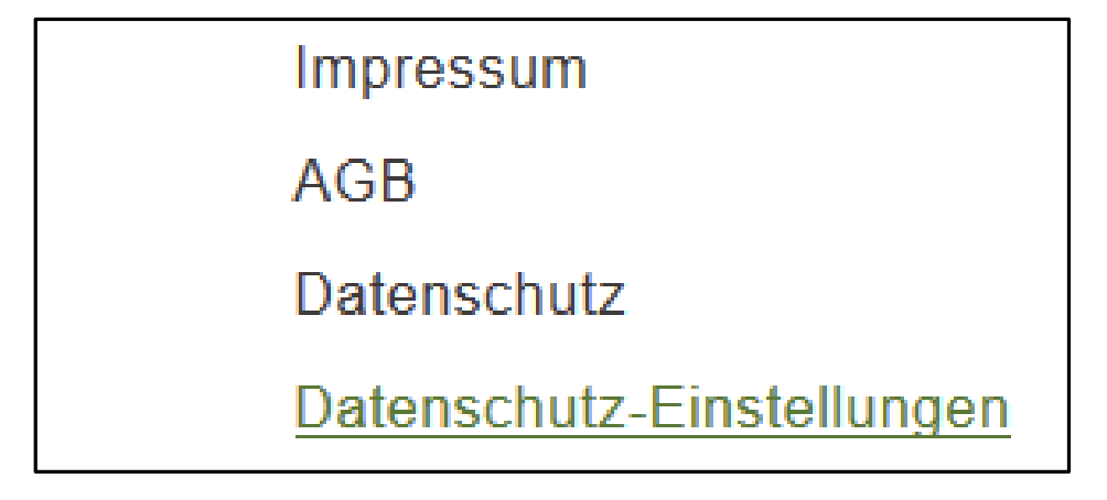
Picture 7. access to the consent layer through the website footer
6. Privacy-Friendly Default Settings
Under Article 25 of the GDPR, systems must be configured by default to process only the minimum amount of data necessary. Many cookie banners, however, set cookies by default or have pre-checked boxes for consent, which violates the GDPR.
Tip: Avoid pre-set cookies or pre-checked consent boxes. Users must actively give consent (Opt-in) before non-essential cookies are activated. Only technically necessary cookies may be used without consent.
Technical Implementation of the Cookie Banner
In addition to visual design, the technical implementation of the cookie banner must not be overlooked. A common mistake is setting non-essential cookies or using external services for which consent is required, before the user has given their consent. This violates Article 6 of the GDPR, Article 25 of the TDDG, and the ePrivacy Directive.
Use tools like decareto to ensure that no cookies are loaded without prior consent. This helps ensure that the technical implementation of your website complies with GDPR requirements.
Sources:
https://www.hh-datenschutz.de/fileadmin/mustervorlagen/Handreichung_Cookie-Consent-Banner.pdf

